Spinners Are the UX Equivalent of “TODO: Fix Later”

We replaced a spinner with a chart-shaped skeleton and realized loading states are part of the layout contract. Bad skeletons cause layout shift. Good ones match the final UI exactly. Here's what we learned fixing ours — and why CLS is a UX problem, not just an SEO metric.
I recently replaced a generic spinner in a set of chart widgets at the top of some of our CI insights pages with a proper skeleton.
The change was small. It made us revisit something bigger than just charts: why skeletons matter at all, and why metrics like CLS exist in the first place.
Our chart widgets weren’t broken. They didn’t shift. They didn’t regress any Core Web Vitals. They just felt off.
That turned out to be the point.
The original state: technically fine, visually lazy
Those chart widgets used to show a centered spinner while loading.
Nothing fancy, nothing wrong:
- No layout shift
- No content jumping
- No obvious bugs
Which is exactly why it shipped.
But every time you looked at it, it felt unfinished. A spinner tells you something is happening, but nothing about what is happening. A chart loading looks exactly the same as anything else loading. There’s no context, no structure, no expectation-setting.
In practice, the UI felt more like a placeholder than a product.
A better loading state: half-built chart widgets
Instead of a spinner, we introduced chart-shaped skeletons for those widgets.
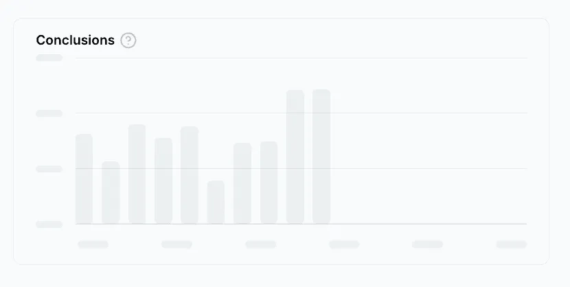
Not a generic block, but something that actually looks like the final chart:
- Y-axis ticks on the left
- Horizontal grid lines
- A bar area with roughly the right proportions
- X-axis label placeholders
The bars animate slightly and re-randomize their heights every couple of seconds, just enough to avoid a dead, static look.
Crucially, the skeleton uses the exact same layout as the real chart. Same height. Same structure. When the data arrives, the chart appears in place instead of replacing something else.
We weren’t trying to make loading prettier. We were trying to make it honest.
Why skeletons matter (beyond aesthetics)
That chart change led to a broader realization: skeletons aren’t just nicer-looking loaders. They directly affect how users perceive and understand your interface.
A good skeleton does a few important things:
- **Perceived performance: **Users see something that already resembles the final UI, which makes the wait feel shorter than staring at an empty box or spinner.
- **Context: **A skeleton communicates what kind of content is coming. A chart skeleton looks like a chart. A table skeleton looks like a table. That reduces uncertainty.
- **Expectation setting: **The skeleton’s shape tells users what to expect next. Rows imply a table. Bars imply a chart. A spinner implies nothing.
Layout stability
Skeletons that mirror the final layout reserve space up front. When data loads, content appears instead of pushing other things around.
This last point is where skeletons stop being “nice UI” and start being a structural concern.
CLS is a UX metric first, an SEO metric second
CLS (Cumulative Layout Shift) is often discussed in the context of SEO and Core Web Vitals. That can make it tempting to dismiss it if your product doesn’t care about search rankings.
That’s a mistake. CLS exists because users hate interfaces that move unexpectedly.
Layout shifts cause:
- Misclicks, when buttons move under the cursor
- Loss of trust, when the UI feels unstable
- Higher cognitive load, because users have to constantly re-orient
- Accessibility issues, especially for users with motor or cognitive difficulties
CLS wasn’t invented as a UX problem: it already existed. Google later defined and standardized it as a metric, giving a name to something users had been complaining about for years.
CLS isn’t about pages jumping. It’s about interfaces breaking the user’s mental model.
Skeletons prevent CLS by design
A good skeleton doesn’t reduce CLS by accident. It prevents it by design.
By matching the final layout, skeletons reserve the right amount of space before data arrives. When the real content loads, it slots into place instead of reshaping the page.
If your skeleton doesn’t match reality, it’s not a skeleton. It’s a guess.
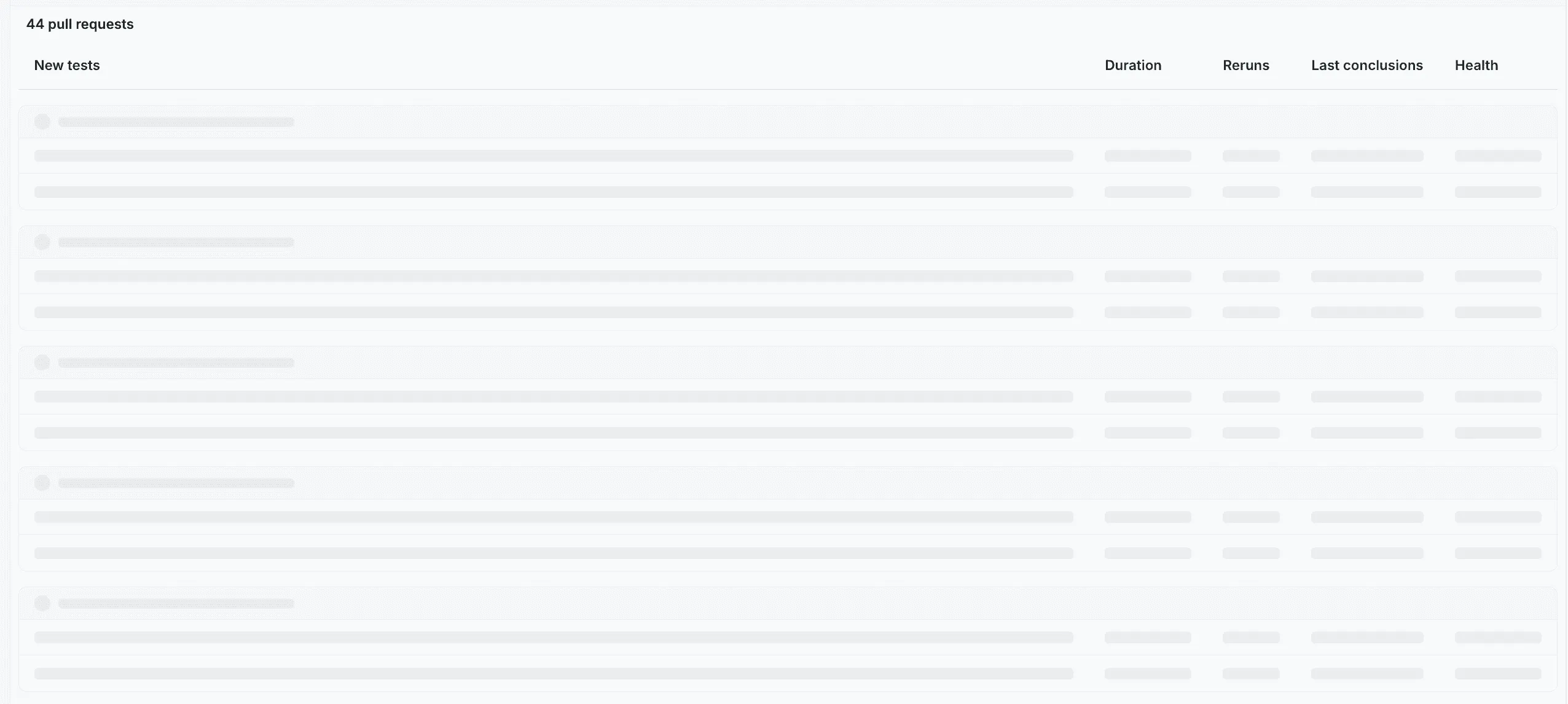
When this actually broke: table pagination
We ran into this problem much more visibly with tables.
While loading, our tables always showed 10 skeleton rows. That seemed reasonable at first. Nothing looked obviously wrong.
The issue appeared once you started paginating.
Most of our tables display 25–30 rows per page. When you clicked “next” or “previous”, we’d briefly render the loading state with 10 skeleton rows, then replace it with 30 real rows once the data arrived.
Every pagination action caused a visible content jump at the bottom of the table.
Nothing was technically broken:
- Pagination worked
- Data was correct
- The skeleton looked fine in isolation
But from the user’s perspective, the interface kept changing height under their cursor. Classic layout shift.
The fix was simple: we stopped treating the skeleton as a generic placeholder and derived the skeleton row count from pageSize.
Once the skeleton showed the same number of rows as the final table, the layout stopped jumping entirely.
This wasn’t a table bug. It was a loading-state bug.
Skeletons can make things worse (if you’re sloppy)
Adding skeletons is almost always an improvement over spinners — but it’s also easy to get wrong.
A bad skeleton can create new problems:
- New layout shift: if the skeleton height/width doesn’t match the real content.
- Janky transitions: if loading and loaded states don’t share the same layout primitives.
- False expectations: if the skeleton implies a chart/table shape, but the real content doesn’t follow.
- Over-animation: if the loader is “doing too much” and becomes the most visually prominent thing on the page.
Over time, we ended up with a few rules of thumb:
- **Match the layout contract: **Same height, same spacing, same alignment. If the loaded state has an axis, header, or row spacing, the skeleton should reserve it too.
- **Derive skeleton structure from real props: **If you have
pageSize, column widths or a fixed widget height — use them. Defaults like “always 10 rows” are where shifts hide. - **Prefer boring animation: **Subtle pulse is fine. Small motion to avoid a dead UI is fine. Anything that draws attention away from the page is not.
- **Keep the swap invisible: **The best loading state is the one users don’t notice changing. Content should appear in place, not as a replacement.
These rules aren’t about polish. They’re about not introducing new UX debt while fixing old UX debt.
The rule we took away
We now treat loading states as part of the layout contract.
Skeletons are not temporary hacks. They’re part of the UI. They need to follow the same rules, constraints, and invariants as the loaded content.
If your loading state doesn’t align with the interface’s shape, users will feel it, even if your metrics look fine. Spinners still have their place. But only when you genuinely don’t know what’s coming.
Everywhere else, a spinner is just a TODO we forgot to delete.